Kai Kurī
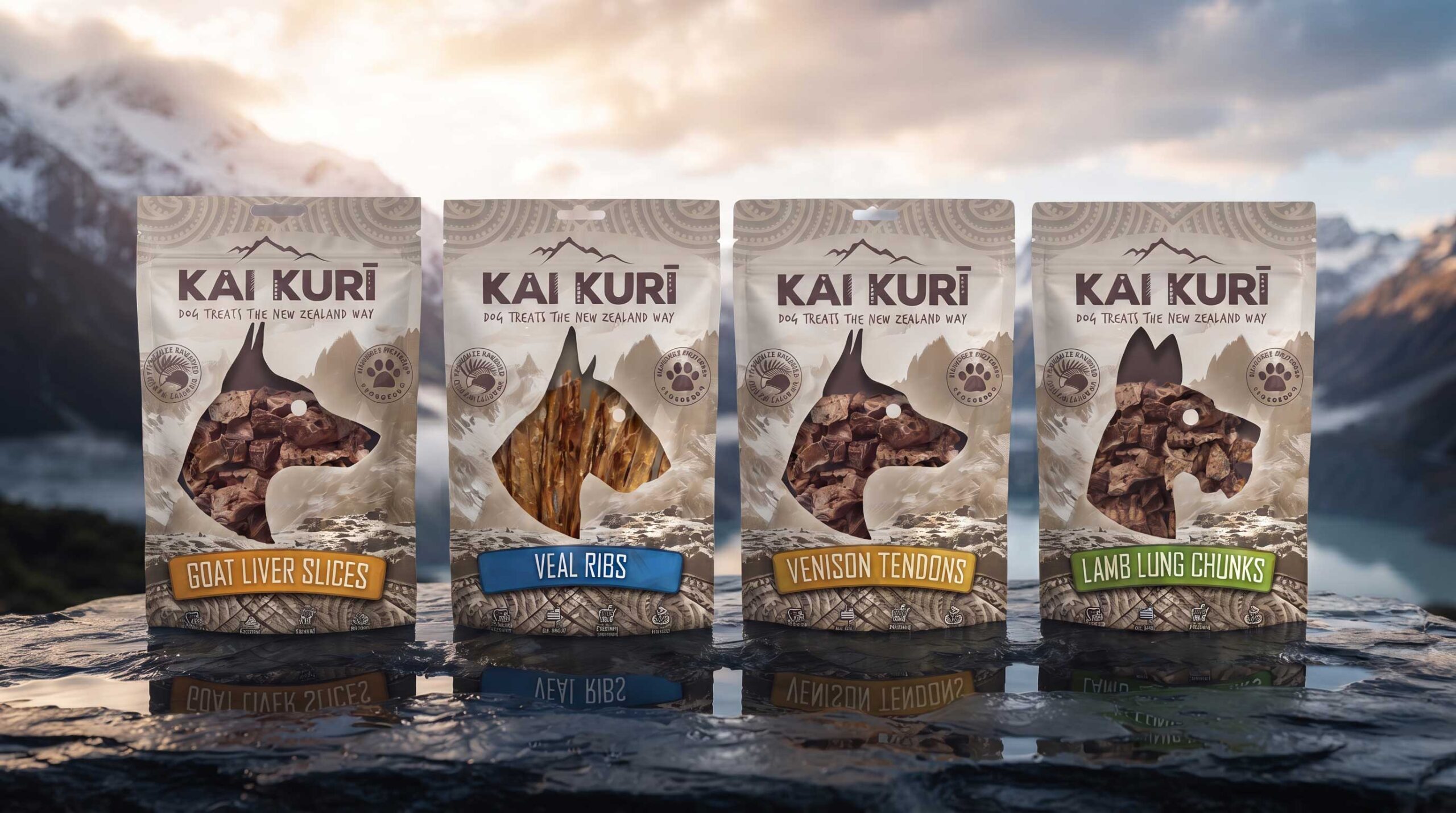
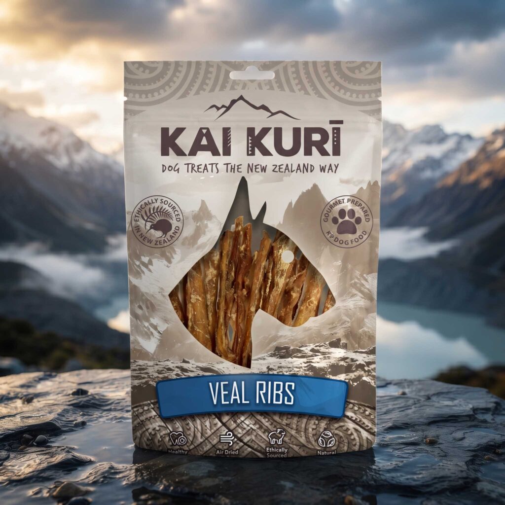
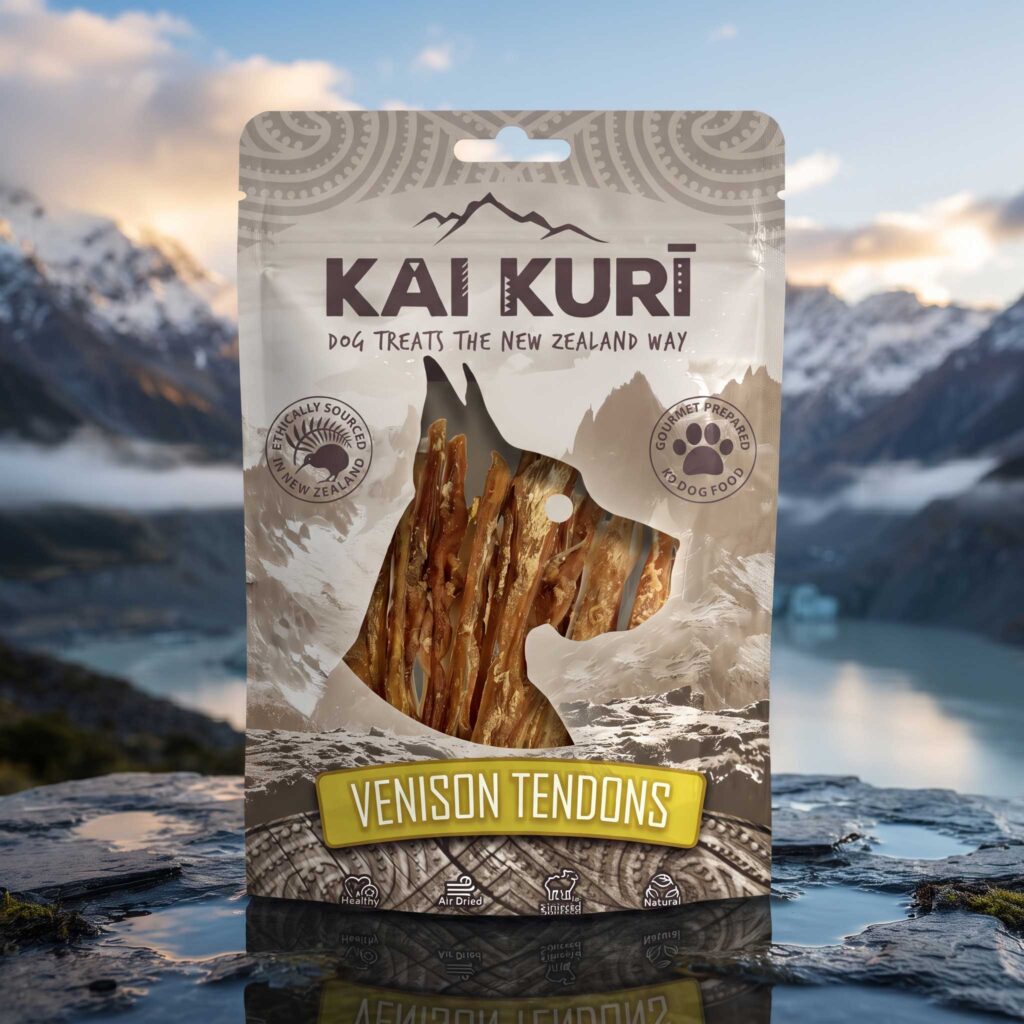
Packaging for Kai Kurī, a range of air-dried dog treats. One pouch system carries four products: a dog-head window shows the treats, and a colour-coded flavour label tells them apart.
About the brand
Kai Kurī makes premium, natural dog treats sourced and made in New Zealand. The name points to both origin and purpose: “kai” is the Māori word for food and “kurī” is the Māori word for dog.
The treats are 100% natural, mostly single-ingredient proteins with no artificial additives, fillers, preservatives or added colours. They come from free-range, grass-fed New Zealand livestock such as lamb, venison, beef, goat and veal, and many are gently air-dried to keep their natural nutrients, flavour and texture.
The range includes unusual proteins such as venison tongue, goat liver slices and lamb lung chunks, which suit dogs with sensitivities to chicken or beef, and chews such as veal ribs, deer ears and beef tendons that satisfy a dog’s urge to chew and help reduce plaque and tartar.
The brand idea
The name does the strategic work before any graphics arrive. “Kai Kurī” is te reo Māori for “food for dogs”, so the pack sells provenance and purpose in two words. The tagline, “Dog treats the New Zealand way”, turns that into a promise. Everything else on the pack either supports that claim or has to hide behind it.
The dog-head window
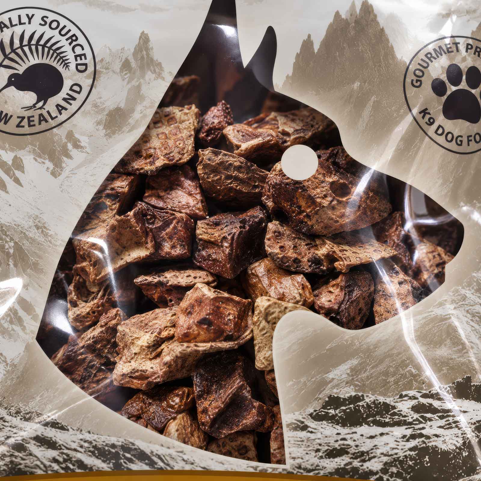
The best idea in the system is the die-cut window in the shape of a dog’s profile, with the actual product visible through it. It is playful and instantly readable as pet food, and it solves a real problem: the contents of this range are not conventionally beautiful. Dried lamb lung, goat liver and venison tendons are, to put it kindly, an acquired look. Most brands would hide them behind a glossy photo of a happy Labrador. Kai Kurī puts the honest product on show and frames it in the most flattering, charming way available. The joke is almost built in: the dog’s head is literally filled with what is inside it, so the head becomes the treat. The tendons and ribs read as wiry, fur-like texture inside the silhouette, and the chunkier lung and liver fill the head like a mosaic.
The window also does smaller jobs. The punched hole becomes the dog’s eye, a witty use of a functional hang-hole. The ears break through the frame at the top, which adds energy and stops the shape feeling boxed in. The window gives the sceptical buyer proof of quality without a single claim, and the humour lowers the “ick factor” so the product feels characterful rather than gross.
Designed around place
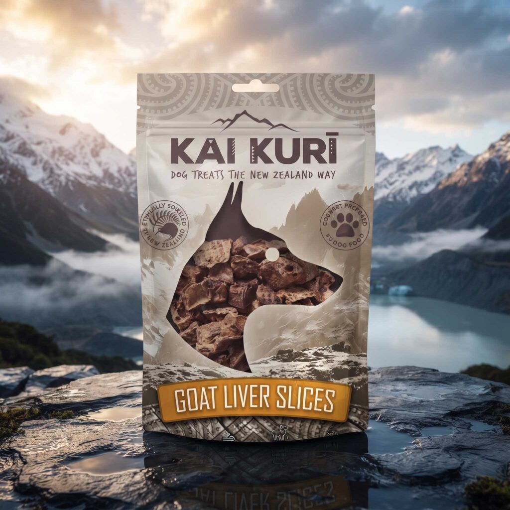
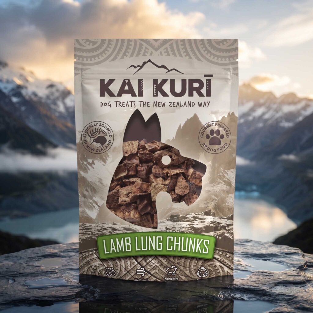
The range is designed around where it comes from. The misty Southern Alps landscape appears twice: as the photographic backdrop of the mockups, and as the tonal mountain illustration printed on the pack itself. The mountain range line mark above the logo ties the identity to that terrain. Colour supports it too, with a restrained palette of stone, taupe and chocolate that feels earthy and natural rather than loud pet-aisle. The bright flavour banners (orange, blue, olive, green) then do the shelf work of variant navigation without breaking the mood.
Pattern and detail
Spiral (koru-style) bands at the top and a woven, carved-looking panel at the base frame the pack like a taonga, and the logo carries small geometric details inside the letters. The kiwi and fern badge reinforces the origin story. The muted tone-on-tone treatment helps all of it read as texture rather than decoration.