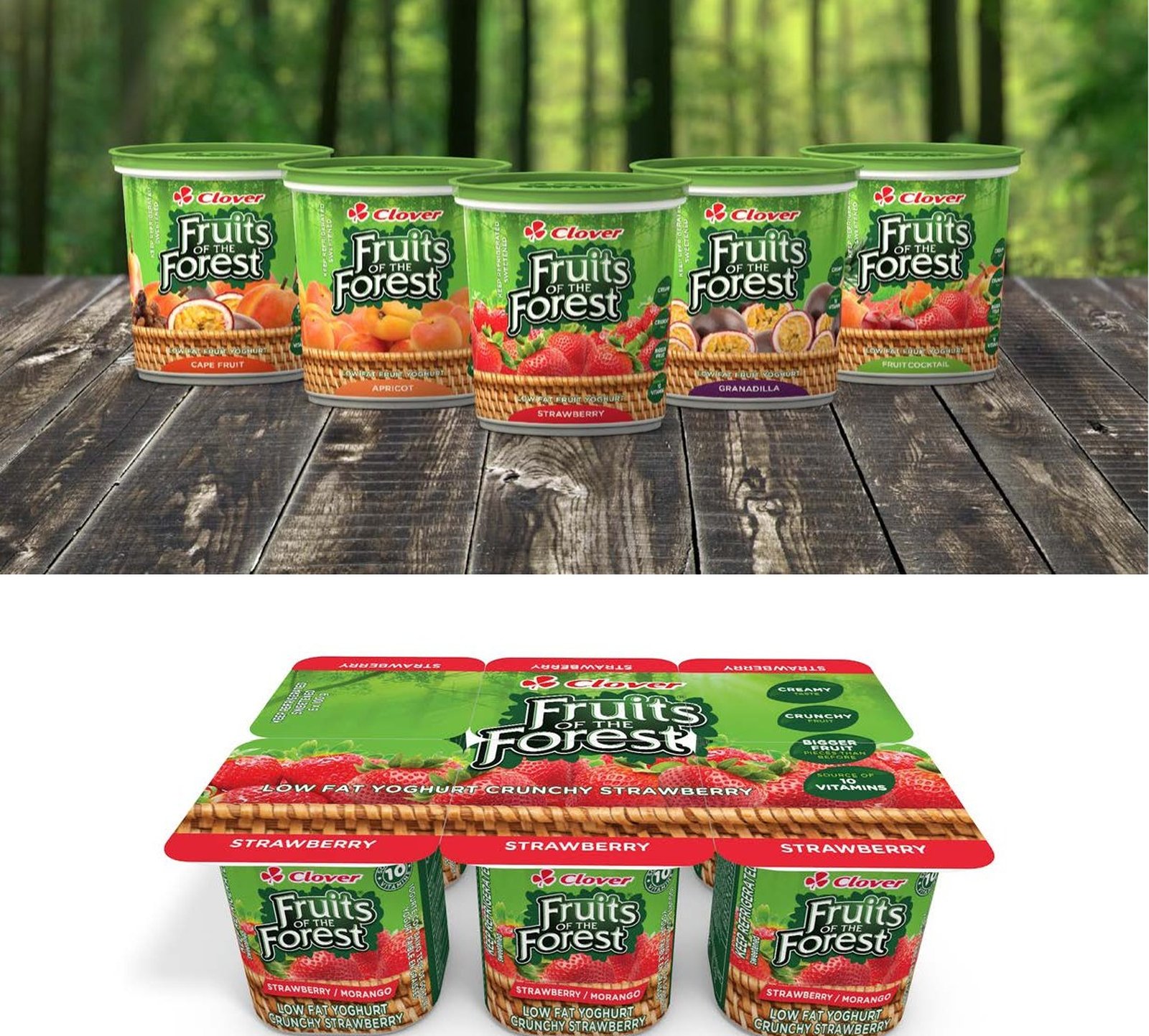
Fruits of the Forest
Fruits of the Forest is a flagship brand for Clover. It had been available for a number of years and was beginning to show its age. The brief was to give the packaging a contemporary feel, and to make it appear to come from a forest to reinforce the brand name.
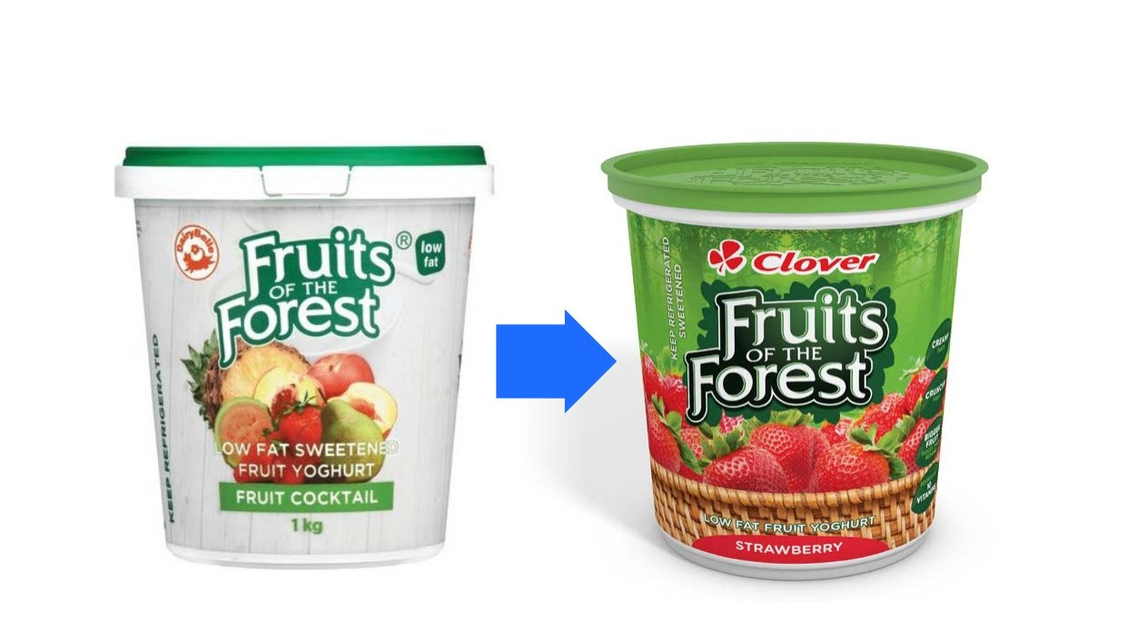
A green forest image was used in the background, for two reasons. It emphasises the forest theme, and it creates a unifying brand block on the shelf, because every flavour gets the same green background. The consistent green makes the brand easy to spot when walking down the aisle of a supermarket. The strategy has worked very well for the brand.